
We had some fun here on the blog talking about the font that Orly Taitz used in her Emergency Appeal to Georgia Secretary of State Brian Kemp.
After a little research, I determined that it was called “Algerian” (or a knockoff of that font). It’s also used on a sign at a hair salon near my house. Here’s the heading from her document:

So we all made fun of Orly Taitz and her wacky font. Well, perhaps we were a little hasty:

Sometimes this blog is a lot of fun.
Learn more:


Algerian? Orly used a Muslim font?
Shhhhhh!
I would note this is a perennial in cheapo 5,000,000 FONTS!!! collections. 😉
Goldleaf on glass is a great use for it, and what it was designed for. Titling and signage. Looks great in casinos too 😀
But as an amateur letterhead! Over euro-style sans-serifs! The horror!
Not to mention the mangling of negative space.
If challenged to imitate Orly, I couldn’t do it. I’d have to subcontract to a random customer from the local hair salon. A salon catering to blue hairs.
It goes with the Tammy Faye eye makeup.
Amended:
Would look great in real gold leaf. Plain drab vinyl, not so much. Vintage type rendered in modern material? Puhh-leeeezzzz, Mr. Secretary, spend a dollah already!
Heh. Still fugly, though.
On my way to work this morning, I noticed a sign for a gym done up in a font that looked a lot like this — but the letter “Y” looked wrong, with the right ascender swooping up dramatically. But now I see that is indeed a feature of this font.
(What does it say that I spotted a sign and immediately thought, “Hey, isn’t that the same font Orly used?”)
Straying even further off topic: what is the fascination out there with Copperplate? It’s not quite as ugly as Algerian, but it’s close. Maybe I’m just not big on serifs in general.
That’s the Secretary of what State? The pattern art in the picture is clearly islamic style too 🙂
You know who else used a pattern like that?
Her use of it was entirely correct. Where she erred was in not printing her emergency appeal on a pane of glass…
Is it a Muslim font or a pied noir font?
I did find someone who claims the font is unchristian:
http://childrensministryonline.com/tag/algerian/
People who minister to children and dogs and who hate Algerian cannot be all that bad.
Oh, you’re hitting close to home, justlw! I used to work for a sign systems firm, the owner of which loved Copperplate. Preferably in heavier weights. When compiling a type study for a new project, we always offered a recommended face and two alternates. Almost without fail, he would insist on wiggling Copperplate in there.
Argh!
Other than that, it was an awesome job. 😀
weird post for a children’s ministry, but hysterical!
I liked this story so much because I got to laugh at myself — so very therapeutic.
Uhm… are you thinking the Greeks? I’ve heard it called “Greek Key.”
“Algerian is reviled for its overuse.” LOL it’s universal.
http://en.wikipedia.org/wiki/Algerian_(virtual_typeface)
I really don’t think we should be mocking her font choice.
We should be amazed she’s not using crayons.
Dunno. I spotted it just driving by that hair salon on the highway.
I’m rather partial to Optima.
http://en.wikipedia.org/wiki/Optima
This is the desktop publishing equivalent of using crayons!
Optima is a classic. My old bosses second favorite. Which made the Copperplate thing all the weirder.
i think in ny, courts require times new roman
Maybe she liked this font because it had a cute little serif on top of the figure 8…like the one on her favorite president’s long form birth certificate.
Not that I’m aware. I’ve submitted papers in Arial (Don’t ask. I used what was on the computer and didn’t bother to change it) and not had them sent back. That’s not to say that it isn’t possible for it to be a rule in some parts. In NY, individual judges tend to set their own rules.
What’s wrong with Arial. I like it.
Arial is very legible on screens. I use it for digital documents; can’t beat Arial Narrow on spreadsheets. Readable and compact. In print, merely OK.
While their advice isn’t universal for the Federal Courts, here are the 7th Circuit’s specifications for briefs — note Times New Roman is specifically prohibited.
http://www.ca7.uscourts.gov/Rules/type.pdf
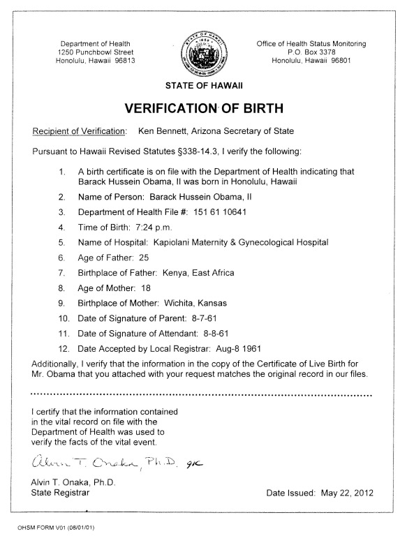
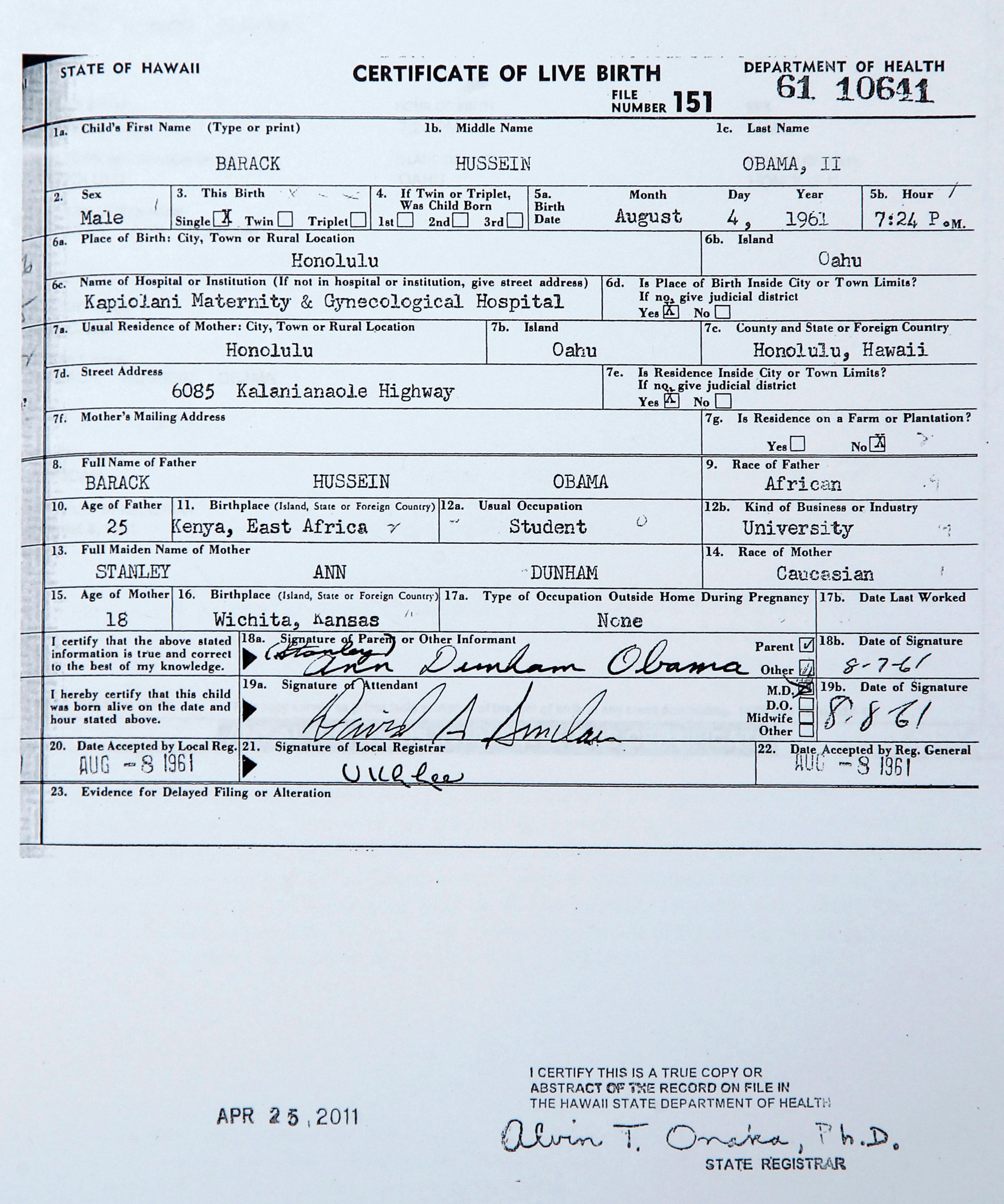
You’d think that, regardless of font choice, Orly could at least express her address correctly.
Notice anything missing from the street address?
simply a taste for kitsch. Matches well with her rebid pink poodle.
Rabid Pink Poodle.
I think it’s fair to say that Orly Taitz isn’t much of a lawyer, but she is primarily is a web publisher. It’s her web publishing that needs desperate help.
The articles look like (and largely are) comments. It’s hard to tell exactly what is what, but the overall impression is very unprofessional. In fact, her comments are formatted better than her articles. Another annoying problem with her site is that whenever she uploads media, rather than hyperlinking to the media, she hyperlinks to a page that links to the media. I know why she does this, a misunderstanding of WordPress, but it’s still bad.
I also believe that if your web site is about content, then some content should be visible on the first page you see. Not so for Orly. One has to page down twice to reach content. That said, Orly’s web site is probably more about her than content, and so perhaps it makes sense that the content is pushed down.
I detest TNR. Like, I really hate it, and I want to punch people who use it.
here are the different state rules
Court rules about typography
http://www.typographyforlawyers.com/?page_id=2254
An incomplete list, but very interesting. Thanks Donna!
Links through to an entire style manual for lawyers, 7 yrs old, but at first glance, lots of help there for Orly ….
http://www.ca7.uscourts.gov/Rules/Painting_with_Print.pdf
An excellent critique of her site, but I would say she’s a social marketer, selling herself desired self image, that of a crusader. Which requires the existence of a crusade. An imaginary crusade driven by the whipcracks of her publishing … all a manic cover for the reality that is Orly Taitz. Attempting stimulate external feedback to reinforce her desired self-image.
Funny but sad as always. The feedback she does get is very addictive for her. Setting up a hard crash.
I noticed this morning a dearth of comments on a string of posts. Not a good sign if that continues!
Court rules about typography
http://www.typographyforlawyers.com/?page_id=2254
sorry, i initially didn’t see my previous post
Wonkette identified the font as “stagecoach” FYI. I believe they called it the “underrated favorite of seventh-grade history presentations”
This really has been a full week or so of white-water rafting on sweet, sweet birfer tears.
Praise
Er, no … it isn’t. The link & article are much appreciated — an interesting read — but the discussion of the merits & drawbacks of Times New Roman are very specifically in the “advice only” category. They strongly recommend another typeface, such as Garamond or Dentury — but they do not “prohibit” anything.
I have added a link in the main article to a collection of typography rules from various jurisdictions from the Typography for Lawyers web site, as well as the document from the 7th Circuit Court of Appeals.
http://www.typographyforlawyers.com/?page_id=2254
http://www.ca7.uscourts.gov/Rules/type.pdf